Babenko logo
pl

Our projects

HeliPartner
web development

HeliPartner

What we delivered

  • Multi-page website

    Structured around products, racking, service, and contact — five major sections.

  • Live product search

    Real-time filtering across dozens of forklifts directly from the header.

  • Interactive service map

    Hover or tap any of 16 voivodeships to find the nearest service center.

  • Google Reviews integration

    Live ratings displayed on the contact page, updating automatically.

  • Babenko CMS

    Custom admin panel — the team adds and edits products independently.

  • SEO optimization

    Per-product structured data, sitemap, and noscript fallbacks for full crawlability.

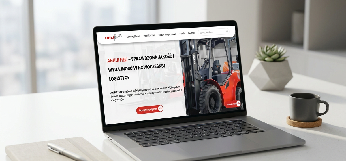
HeliPartner needed more than a brochure site — they needed a working tool that helps customers find the right forklift, locate their nearest service center, and build trust before the first phone call. We delivered a full multi-page site covering the company, its product catalog, racking systems, mobile service network, and contact channels.

The product catalog is fully searchable. A live search bar in the header filters across the entire inventory in real time as the customer types, surfacing matching forklifts grouped by category — paletowe, podnośnikowe, reach trucks, container handlers, scissor lifts, and more. Each product has its own SEO-optimized detail page with full technical specs, structured data for Google's Product rich results, and a related-products carousel.

Service is handled through an interactive map of Poland — customers hover or tap any of the 16 voivodeships to see the contact details of the nearest service center, with a no-JavaScript fallback ensuring search engines and accessibility tools index every region.

The site is integrated with Google Reviews via the Places API, displaying live ratings on the contact page so social proof updates automatically as new reviews come in. We built a custom Babenko CMS so the team can add new products, edit specs, swap images, and manage racking entries independently — without touching code.
Visit live site→
HeliPartner Serwis
web application

HeliPartner Serwis

What we delivered

  • Dedicated web application

    Built around HeliPartner's service workflow.

  • Service requests

    Every job tracked from report to completion, with status, machine, and assignee.

  • Customer database

    Full client registry linked to their machines and service history.

  • Technician management

    Assign jobs to the right technician and see who is handling what.

  • Forklift registry

    Each machine with its own record and complete service history.

  • Ordered data and processes

    Requests, customers, technicians, and machines in one consistent system.

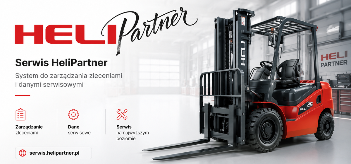
After the HeliPartner website came the part of the business customers never see — the service operation. HeliPartner wanted a single system covering the whole process, from a reported fault to a completed repair.

We built a dedicated web application around service requests. Every report is a record with the customer who submitted it, the forklift it concerns, the technician assigned to it, and its current status — so anyone on the team can see exactly where a job stands, from the first phone call to the finished repair.

Customers, technicians, and the forklift fleet each have their own registry, and all three are linked to the request history. Opening a machine shows everything that was ever done to it; opening a customer shows every machine they own and every job logged against it.

The scope was shaped by how HeliPartner works day to day — each module maps to a real step in the service process, so the system fits the company's way of working rather than the other way around.

Night Breath
web development

Night Breath

What we delivered

  • Multi-page website

    Structured around product, benefits, story, and customer trust.

  • SEO optimization

    Clean structure, fast performance, and content built to rank.

  • E-commerce shop

    Secure checkout and smooth purchase flow, integrated into the brand experience.

  • Babenko CMS

    Custom admin panel to manage orders, products, and blog independently.

  • Blog

    The team publishes and edits articles directly through the CMS.

  • Clear product storytelling

    Benefits-first messaging that builds trust.

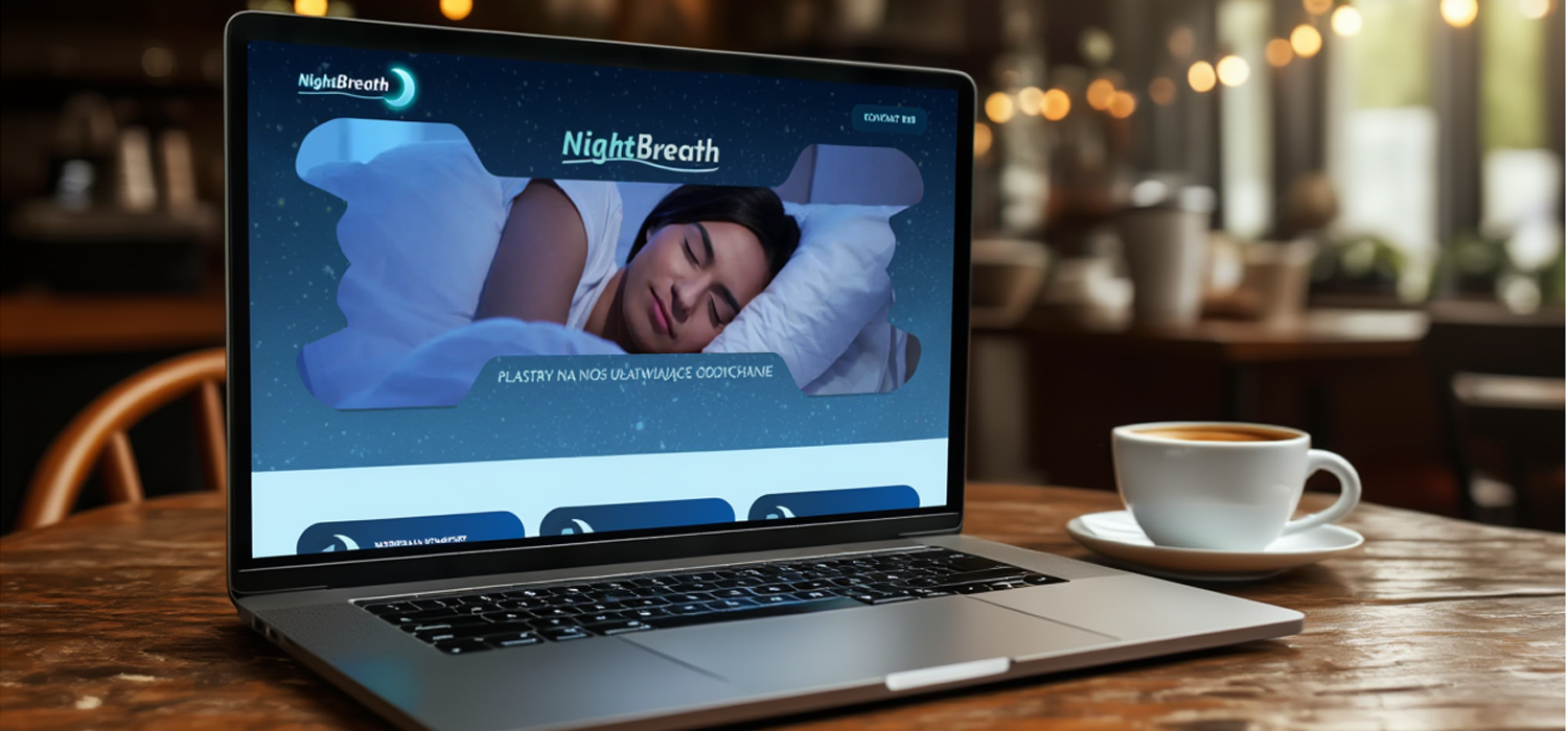
Night Breath needed a full multi-page website to support its growing wellness brand — not just a single landing page. We built a structured, multi-section site that walks visitors through the product, the science behind it, customer testimonials, and the brand story.

Every page is optimized for SEO from day one, with clean URL structure, fast load times, and content built around the keywords customers actually search for. The site includes a full e-commerce shop with secure checkout and a smooth purchase flow integrated directly into the existing design.

We built a custom Babenko CMS so the team can manage the entire operation independently — processing orders, adding and editing products, and publishing blog articles — all without touching code or needing a developer for every change.

Visit live site→
Wojciech Kosiński
web development

Wojciech Kosiński

What we delivered

  • Single-page landing site

    Focused scroll covering services, process, testimonials, and contact.

  • Detailed FAQ

    Answers the questions clients ask most in sensitive real estate cases.

  • Contact form via email

    Every inquiry is delivered straight to the client's inbox — fast and confidential.

  • Trust-first design

    Calm, professional tone suited to a discreet, high-stakes service.

  • SEO optimization

    Structured metadata and local keywords targeting Warsaw searches.

  • Fully responsive

    Polished experience on every screen size.

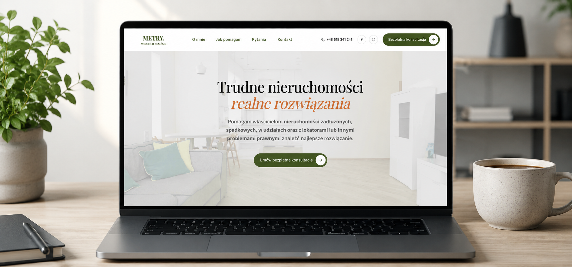
Wojciech Kosiński helps owners of complicated properties — debt-laden, inherited, jointly owned, or facing bailiff auction — find the best way out. He needed a focused landing page that builds trust fast, explains a sensitive service clearly, and turns visitors into consultation requests.

We built a single-page site that walks visitors through the situations he handles, the step-by-step process of working together, client testimonials, and a detailed FAQ addressing the questions that come up most often in these difficult cases.

The contact form lets clients describe their situation privately and sends each request straight to the client's inbox by email — no dashboard to check, just a fast, confidential channel with a promised response within 12 hours.

Visit live site→
Cortinas-Rolety
web development

Cortinas-Rolety

What we delivered

  • Modern multi-page website

    Clear structure for product categories and services.

  • Optimized for SEO

    Built to rank well for relevant local searches.

  • Mobile-first design

    Flawless experience on every device.

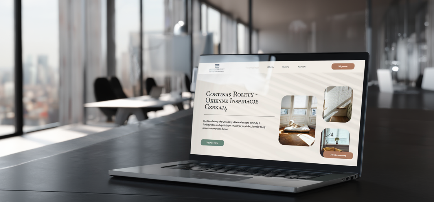
Cortinas-Rolety needed a website that could showcase a wide range of window covering products while making it easy for customers to request quotes and consultations. We built a modern, multi-page site with a clean product catalog, smooth galleries, and a streamlined contact flow.

The result is a calm, elegant presentation that mirrors the quality of the physical products — fast to load, comfortable to navigate, and built to scale as the catalog grows.

Visit live site→
Style Your Size
graphic design

Style Your Size

What we delivered

  • Logotype design

    A modern mark created from scratch for the brand's character.

  • Elegant, contemporary tone

    Visual language matched to a fashion footwear audience.

  • Legible at any scale

    Clear and recognisable from a favicon to a large-format print.

  • Online and offline ready

    Works on the web, on products, and on promotional materials alike.

  • Consistent brand foundation

    One signature to build the rest of the visual identity around.

Style Your Size makes fashionable footwear for women, and needed a visual identity that matches the product: contemporary, confident, and unmistakably its own. The starting point was the logotype — the one element that appears everywhere the brand does.

We designed a modern mark built for elegance and legibility in equal measure. A logo for a fashion brand has to feel refined, but it also has to survive being shrunk into a profile picture, printed on a box, or embossed on a label — so clarity of form mattered as much as character.

The result works across every context the brand operates in: online, on the products themselves, and on promotional materials. One consistent signature that stays recognisable at any size and gives Style Your Size a stable foundation to build the rest of its identity on.

S&V Logistics
web development

S&V Logistics

What we delivered

  • Service & cargo type overviews

    Clear presentation of complex offerings.

  • Built for international clients

    Professional tone, clean structure, fast performance.

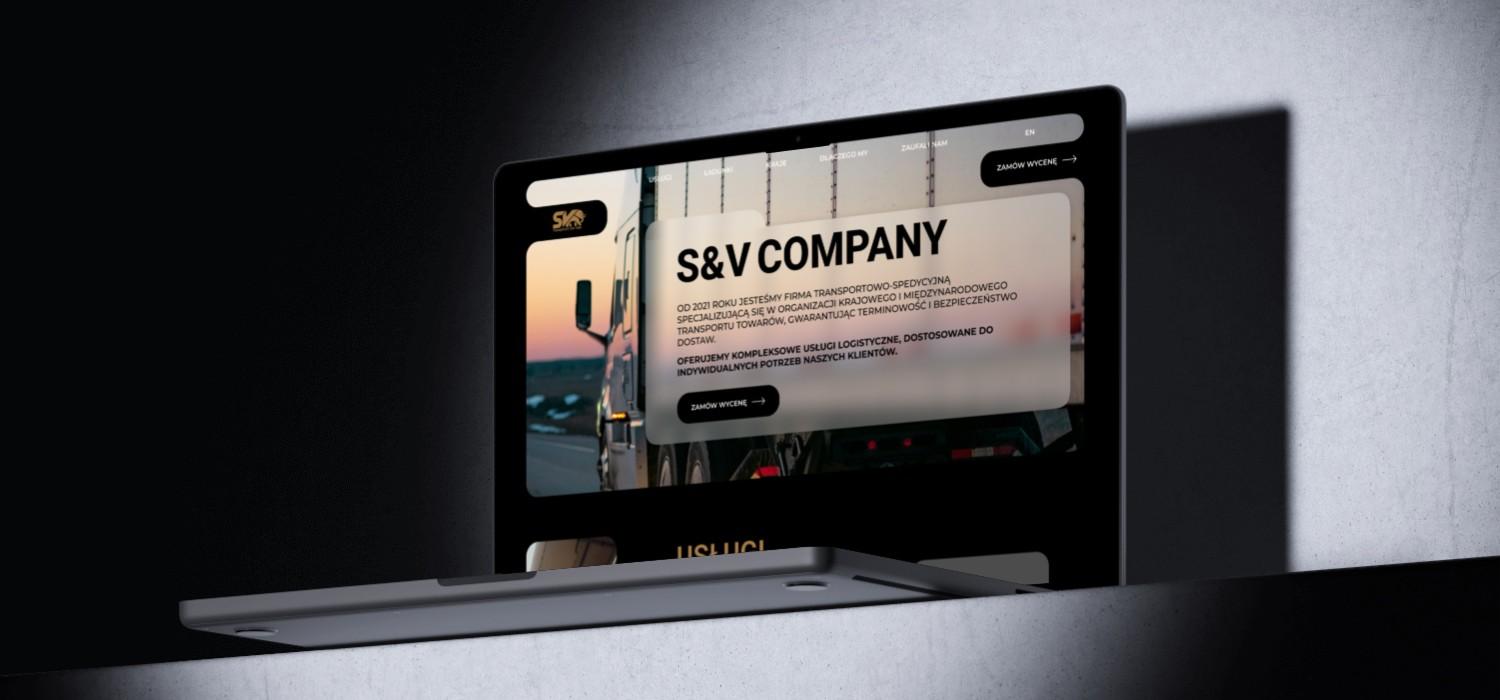
S&V Logistics needed a website that could communicate complex logistics services to international clients while making it simple to request a quote. We delivered a structured, professional site that walks visitors through service offerings, cargo types, and the quote process step by step.

The interactive quote form replaced back-and-forth emails with a streamlined intake — clients get fast responses, and the team gets clean, structured data on every inquiry.

Visit live site→
Mil Group (Demo)
demo project

Mil Group (Demo)

What we delivered

  • Demo / portfolio project

    Built to showcase our approach — not a live client deployment.

  • Single-page layout

    All key information presented in one focused scroll.

  • Professional, on-brand design

    Visual language matched to the industry tone.

  • Fully responsive

    Looks polished on every screen size.

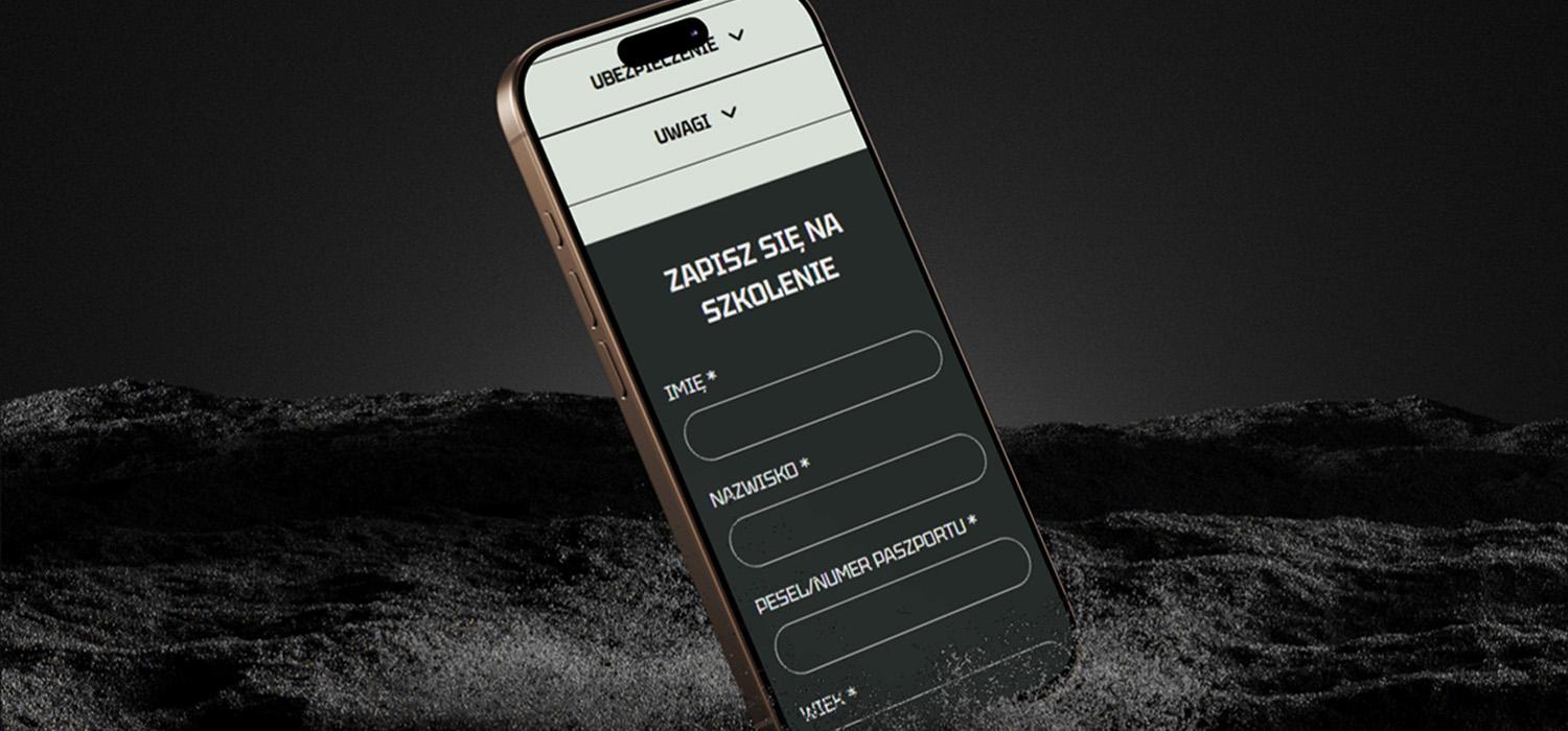
This is a demo project — a single-page website concept built to demonstrate how a specialized service business can present itself online with credibility and clarity. It's not a live client website, but a portfolio piece showing our approach to design, structure, and tone.

The single page focuses on what matters most for this kind of business: a strong first impression, a clear overview of training and security services, and an obvious next step for visitors who want to get in touch.

Visit live site→
Dent World (Demo)
demo project

Dent World (Demo)

What we delivered

  • Demo / portfolio project

    Built to showcase our approach — not a live client deployment.

  • Patient-focused information architecture

    Services and FAQs organized around real questions.

  • Calm, trustworthy visual design

    Reassuring tone that fits a healthcare context.

  • Fully responsive

    Looks polished on every screen size.

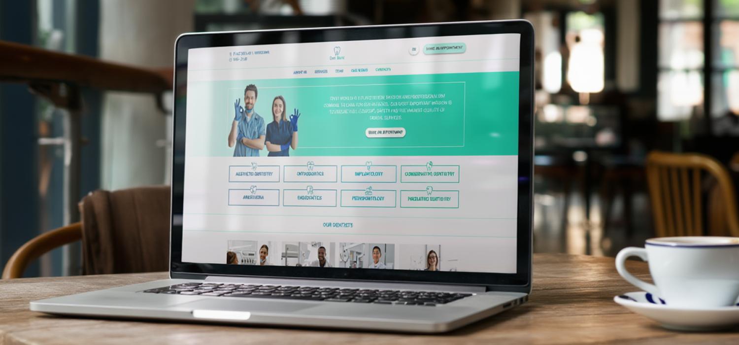
This is a demo project — a dental clinic website concept built to demonstrate how a healthcare business can present itself online with warmth, clarity, and trust. It's not a live client deployment, but a portfolio piece showing our approach to design and information architecture in a sensitive, patient-facing context.

The concept is built around two priorities: helping new patients quickly understand the services offered, and making the path to contact effortless. Calm colors, generous spacing, and a clear visual hierarchy create the kind of first impression a real clinic would benefit from.

Visit live site→

Get in touch with us

We will answer you as soon as possible